Warning! This post describes some intuitions behind the idea of the functional boxplots. I think that it is a very useful technique, but all statistical tools should be used with caution. Reading only one blog post might be not enough to apply them in practice. At the end of the post, I added an information about useful resources covering this topic in a more rigid way.
A classical boxplot is an excellent tool for the quick summary of the data. But sometimes they might be not appropriate, especially when the data has a functional nature. E.g., the data are a repeated realization of some process. It might be a collection of investment, daily visits on a website, etc.
Let me show you some example data set created from the number of visits to a website in a given hour of each day. Firstly I need to do some preprocessing because the raw data is stored in quite an unfriendly way, but as a result, I should get a matrix with 24 columns (24 hours in a day) and N rows (number of days).
library(DepthProc)
data(internet.users)
ind <- which(internet.users[, 1] == 1)
views <- internet.users[ind,6]
views <- views[1:(floor(length(views) / 24) * 24)]
views <- t(matrix(views, nrow = 24))

views[1:3,]
## [,1] [,2] [,3] [,4] [,5] [,6] [,7] [,8] [,9] [,10] [,11]
## [1,] 29085 26617 18487 13349 9914 7609 8592 13302 29840 71610 120686
## [2,] 67554 34122 18995 13430 13947 24522 68745 208126 296261 342271 347002
## [3,] 73474 33831 19396 13423 13055 21495 60212 165963 224436 244082 240679
## [,12] [,13] [,14] [,15] [,16] [,17] [,18] [,19] [,20] [,21]
## [1,] 151594 198866 220806 190650 229848 279205 335689 405054 460121 406504
## [2,] 318616 291321 359761 368471 376364 350046 383333 366969 343673 309038
## [3,] 270410 352700 326936 373558 392843 413316 327271 301763 290014 276614
## [,22] [,23] [,24]
## [1,] 301614 230279 128147
## [2,] 284200 232149 149547
## [3,] 321144 248461 158098matplot(t(views[1:20,]), type = "l", lty = 1, xlab = "Hour of a day", ylab = "Number of visits")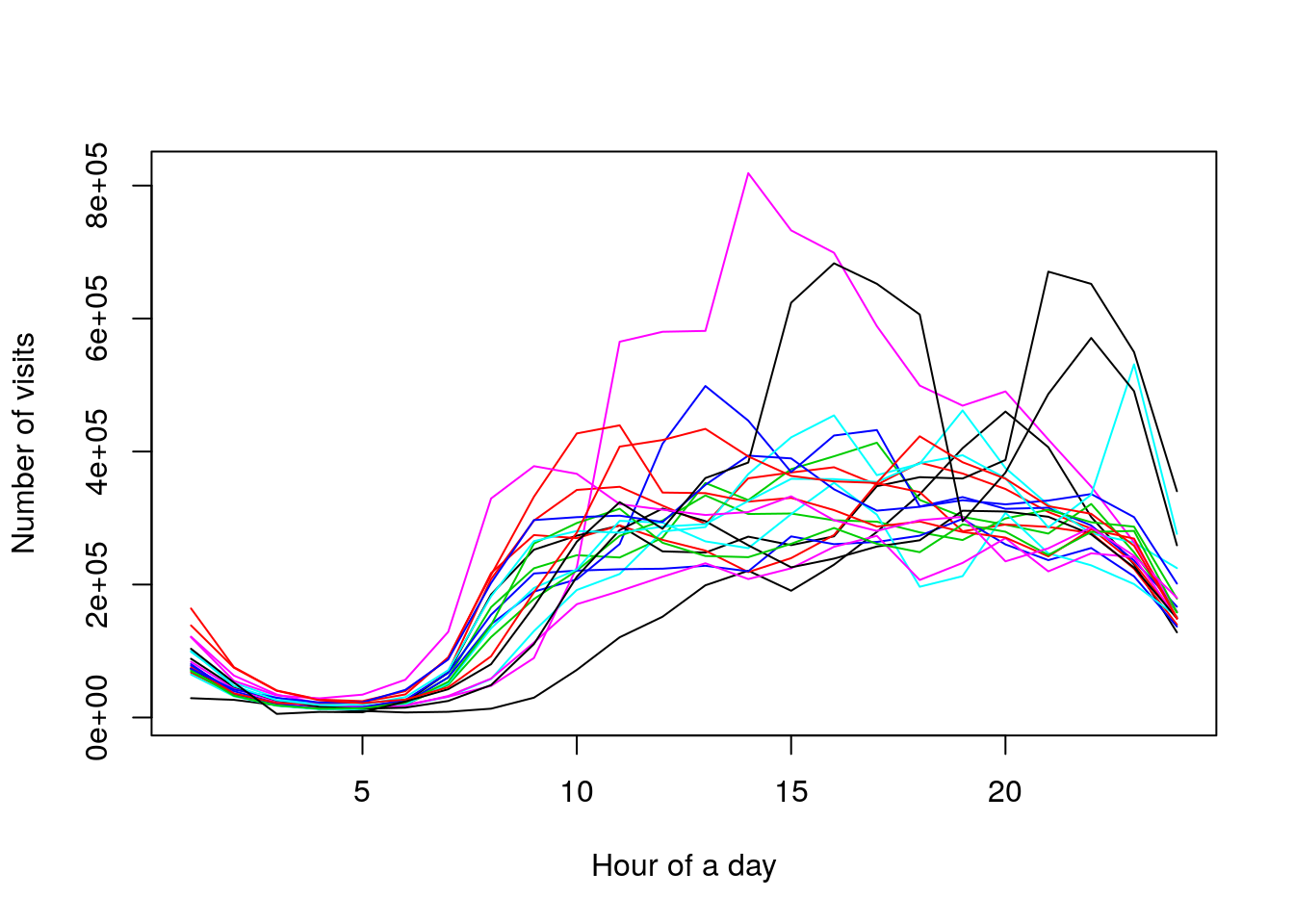
But let’s start with a much simpler analysis. I will use simulated data because I think it’s much easier to show a basic idea when I work in an entirely controlled environment (I know how I created the observation).
set.seed(123)

x <- rbind(
  rnorm(20, mean = 3.0),
  rnorm(20, mean = 1.5),
  rnorm(20),
  rnorm(20, mean = -1.5),
  rnorm(20, mean = -3.0)
)

matplot(t(x), type = "l", lty = 1, col = c(3,2,1,2,3))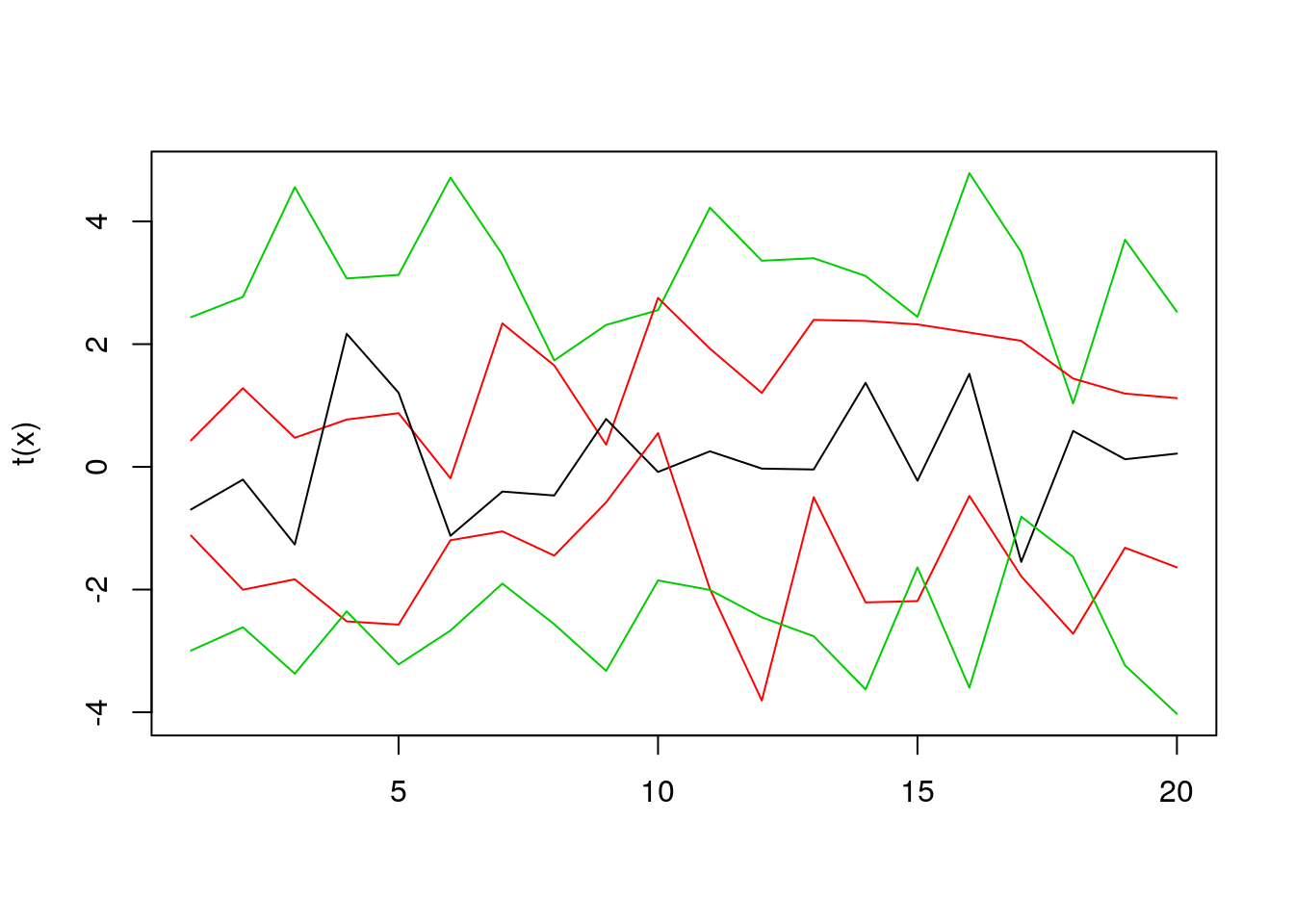
Assume that we have five lines, like in the plot above. How to decide which one is the most central? In this case, it’s easy to do so, just by looking at the plot. But what to do when we have much more lines? One idea is to count the average time in which each line is between other lines, and select the line with the highest score (note that as a by-product we get a score to rank the lines by their “centrality”). Estimating the average time spent between other lines is an over-simplified idea behind Modified Band Depth. I won’t give you a formal definition here, you can find it in “Sun, Y., Genton, M. G. and Nychka, D. (2012),”Exact fast computation of band depth for large functional datasets: How quickly can one million curves be ranked?" Stat, 1, 68-74." or “Lopez-Pintado, S. and Romo, J. (2009),”On the concept of depth for functional data," Journal of the American Statistical Association, 104, 718-734."
So let’s rank the curves using the fncDepth function from DepthProc package.
fncDepth(x)## Depth method: MBD
## [1] 0.430 0.685 0.775 0.630 0.480As you can see the middle value is the highest because it was the line in the middle. First and last values are the smallest because they’re on the edge of the plot.
Now, let’s move to a bit more complicated example. In this case, we will have 50 curves, created from Brownian motion, and shifted randomly (by value from means variable).
means <- sort(rnorm(30, sd = 3))

x2 <- t(
  sapply(
    means,
    function(x) x + cumsum(rnorm(50, mean = 0.1))
  )
)

matplot(t(x2), lty = 1, type = "l")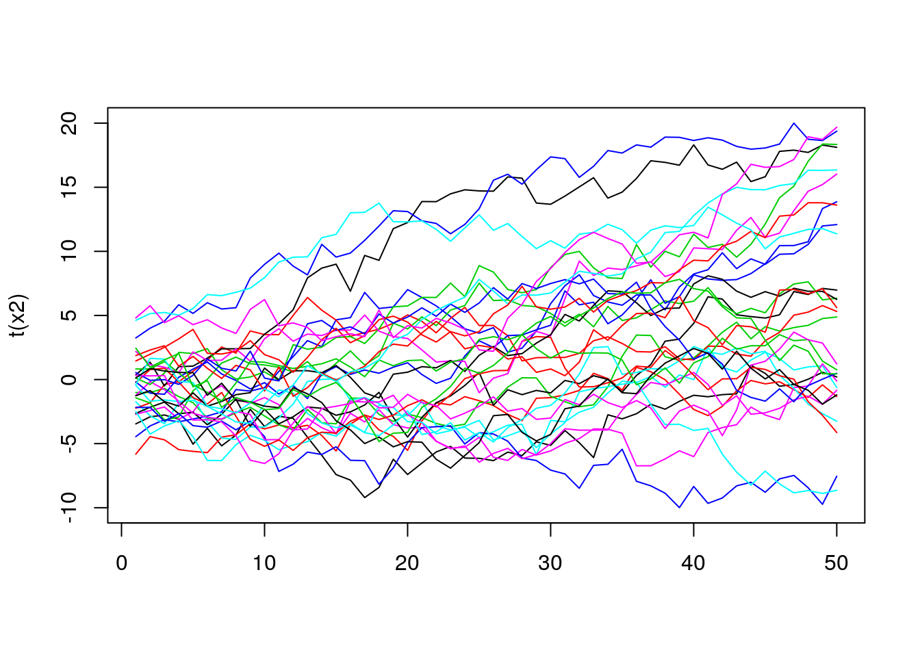
In this case, it’s much harder to see which line is the most central one. However, to get some intuition about the distribution of the lines we can use the depth value to do some coloring. For example, the more central (in terms of its depth) the curve is, the darker color we will use.
depths <- fncDepth(x2)
ecdfDepths <- ecdf(depths)(depths)

colors <- rev(paste0("grey", 1:100))
colIdx <- ceiling(ecdfDepths * 100)
matplot(t(x2), lty = 1, type = "l", col = colors[colIdx])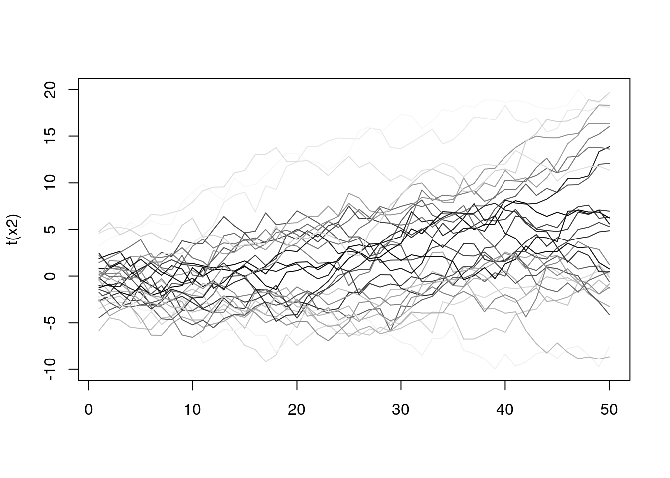
Now it’s a bit easier to see how the lines behave, and it seems that a lot of them are quite similar regarding depth. To get even more info we can mark on the plot those curves that are in the top N% (we still use depth to rank them). The chart below shows all the curves, but the top 10% are red colored.
top10 <- (ecdfDepths > 0.9) + 1
matplot(t(x2), lty = 1, type = "l", col = top10, lwd = top10)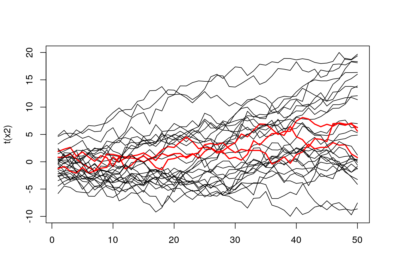
The same plot, but containing 50% of top curves.
top50 <- (ecdfDepths > 0.5) + 1
matplot(t(x2), lty = 1, type = "l", col = top50, lwd = top50)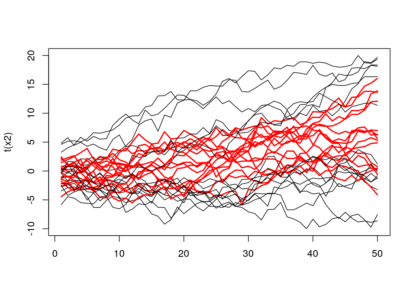 When we examine the plot above, we can see a bunch of red curves. To better understand their aggregate behavior we can create a band formed from extreme values. So it will work as follow, we select top N% of curves, and then in every point, we take their extremes. See the code below.
top50curves <- t(x2)[,(ecdfDepths > 0.5)]
top50ranges <- apply(top50curves, 1, range)
matplot(top50curves, col = 1, lwd = 1, lty = 1, type = "l")
lines(1:50, top50ranges[1,], col = "red", lwd = 3)
lines(1:50, top50ranges[2,], col = "red", lwd = 3)
lines(top50curves[,1], col = "green", lwd = 2)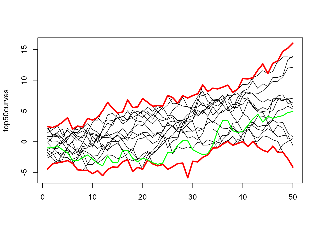
In the plot above I added the green line to show the evolution of one of the lines from those top 50%. As we can see for some time, it was at the bottom, but in the end, it finishes somewhere in the middle.
Now we can move to the functional boxplot, which is just a plot formed by plotting multiple bands for the various number of curves. In the next examples, I will use a DepthProc::fncBoxPlot, which takes as arguments the matrix with the data and cutoffs for bands. Note that “0” means the curve with the highest depth value, and “1” is all curves, and 0.5 is top 50%, and so on.
fncBoxPlot(x2, bands = c(0, 0.5, 1))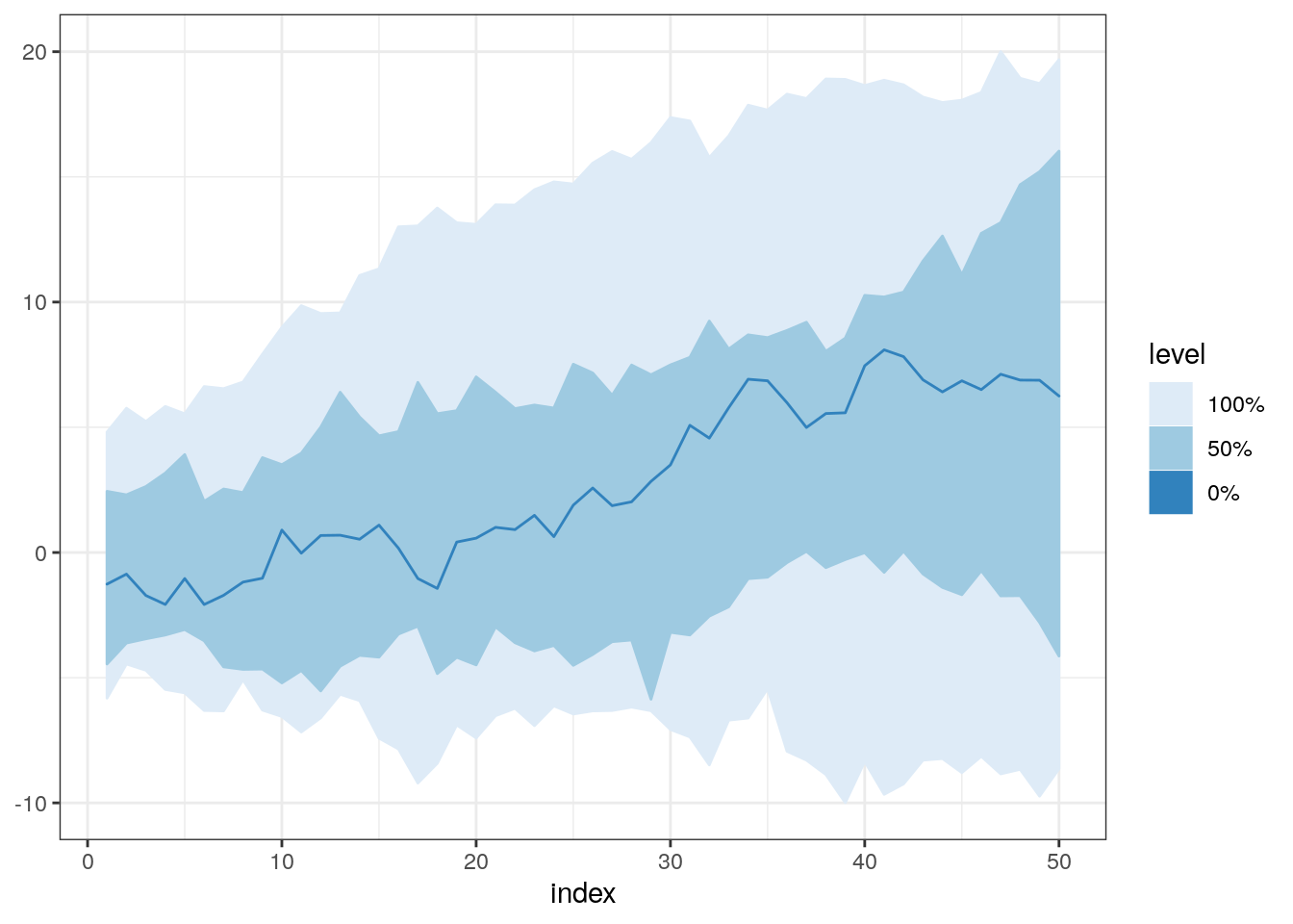
It might be good to try a few different combinations for bands parameter. For example, when we take 0.5 and 0.75, we can see that at the beginning of the plot there’s no difference between those bands. It might mean that there was no real difference in the shape of those lines in that time interval. It’s impossible to spot this using standard boxplot because it does not take into account the whole history of all curves, and examines them only in one specific time point.
fncBoxPlot(x2, bands = c(0, 0.5, 0.75, 1))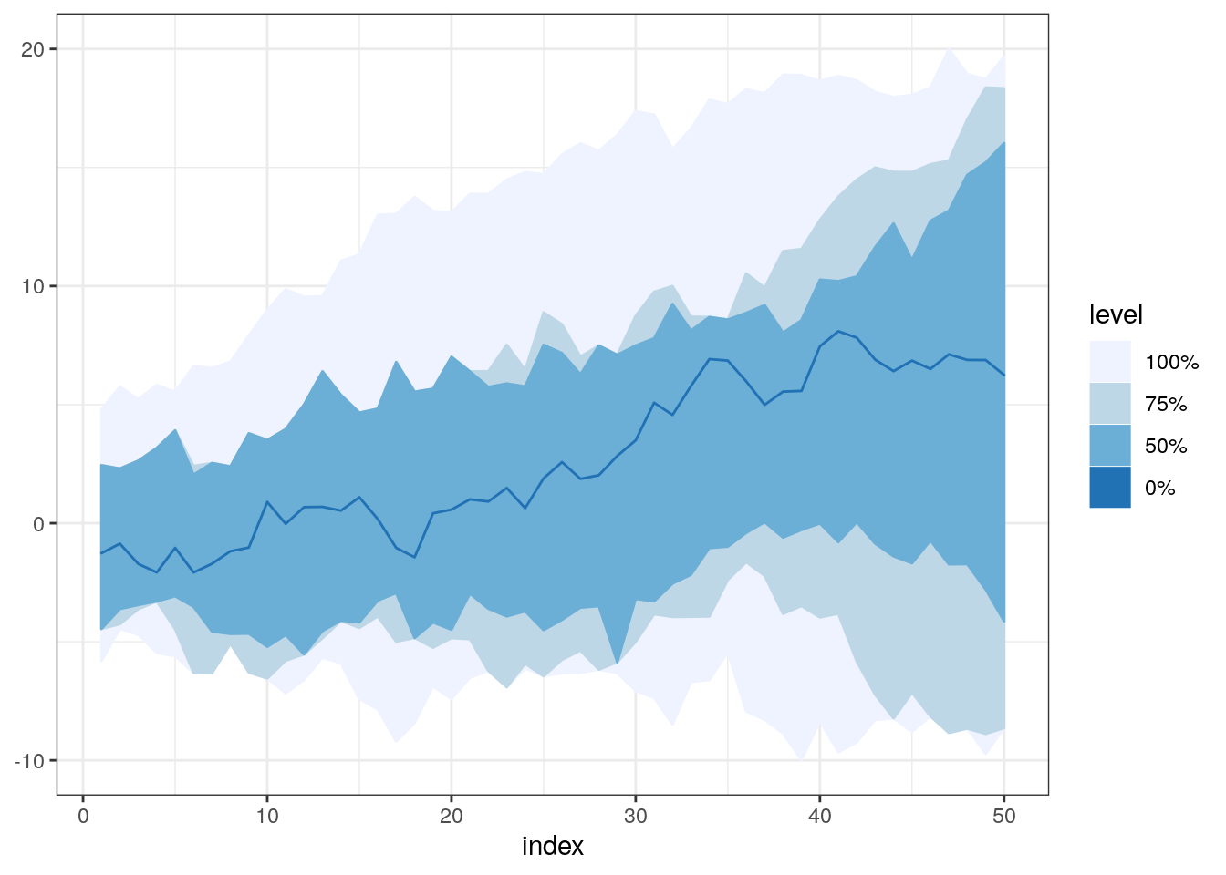
boxplot(x2)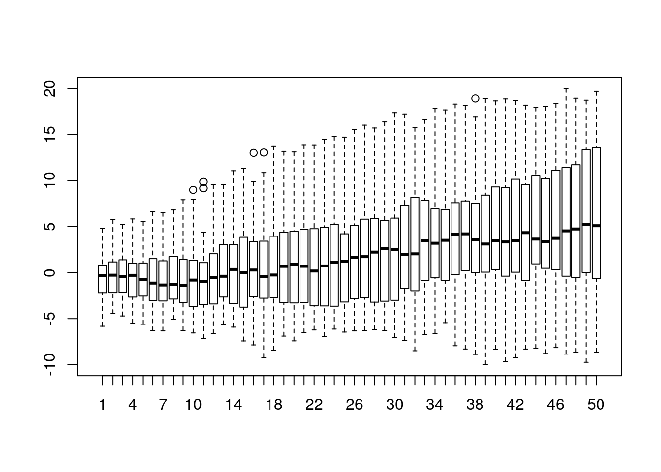
Other tools for functional boxplots.
In this post, I used a fncBoxPlot function from DepthProc package, because I’m the author of this function. But you can use the implementation from fda package called fbplot. It might be even better in some circumstances because it has support for detecting outliers (something that I need to implement in DepthProc), but it uses the base graphics, not the fancy ggplot2:)
library(fda)
fda::fbplot(t(x2), prob = c(0.5))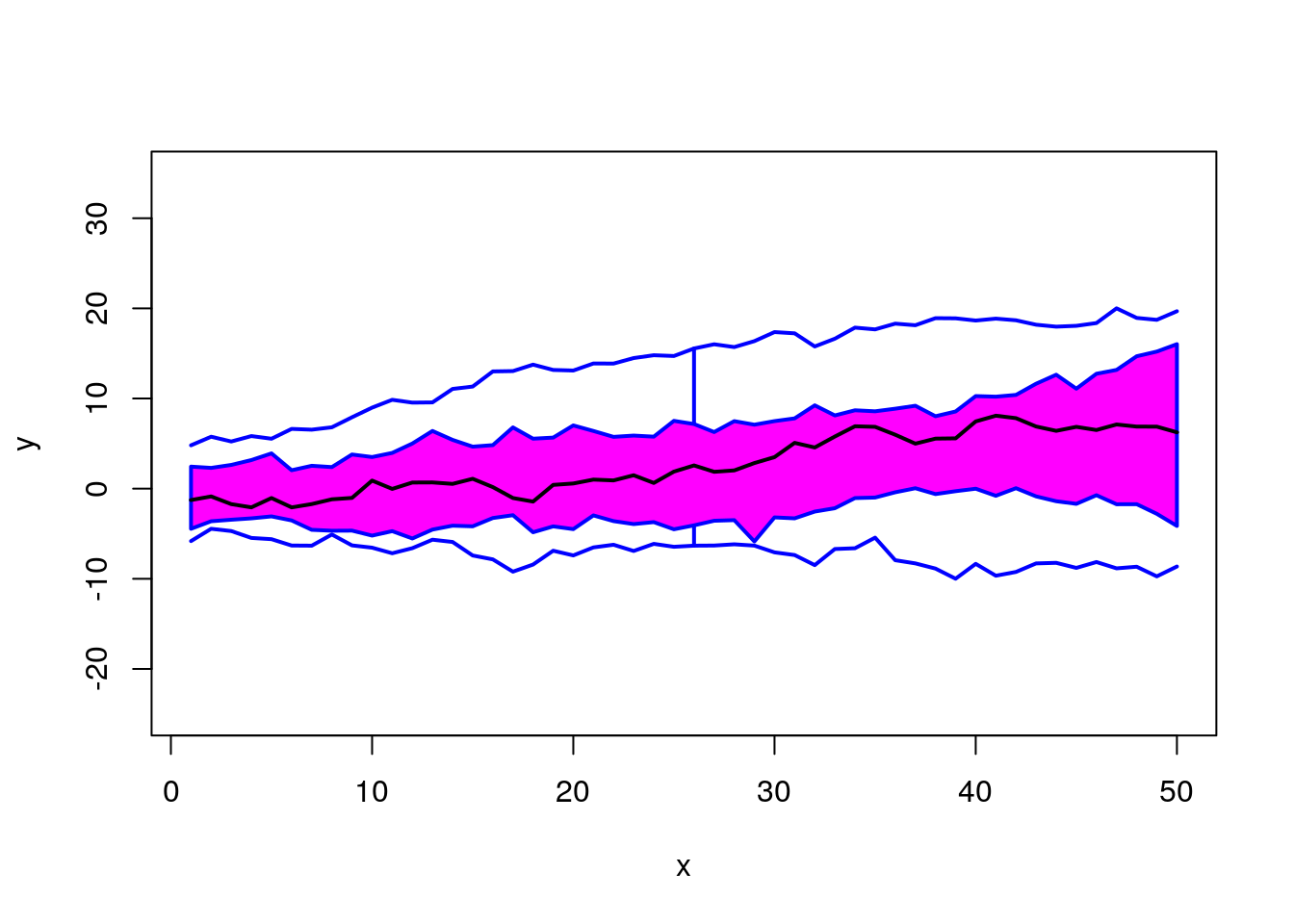
## $depth
##  [1] 0.24965517 0.33931034 0.48579310 0.42041379 0.41719540 0.29177011
##  [7] 0.48386207 0.46078161 0.47880460 0.17471264 0.34537931 0.34160920
## [13] 0.19181609 0.43770115 0.35485057 0.50822989 0.34013793 0.40597701
## [19] 0.52321839 0.50850575 0.50988506 0.41222989 0.38583908 0.39779310
## [25] 0.39687356 0.40827586 0.48790805 0.09866667 0.19200000 0.28413793
##
## $outpoint
## integer(0)
##
## $medcurve
## [1] 19
fda::fbplot(t(x2), prob = c(0.75, 0.5))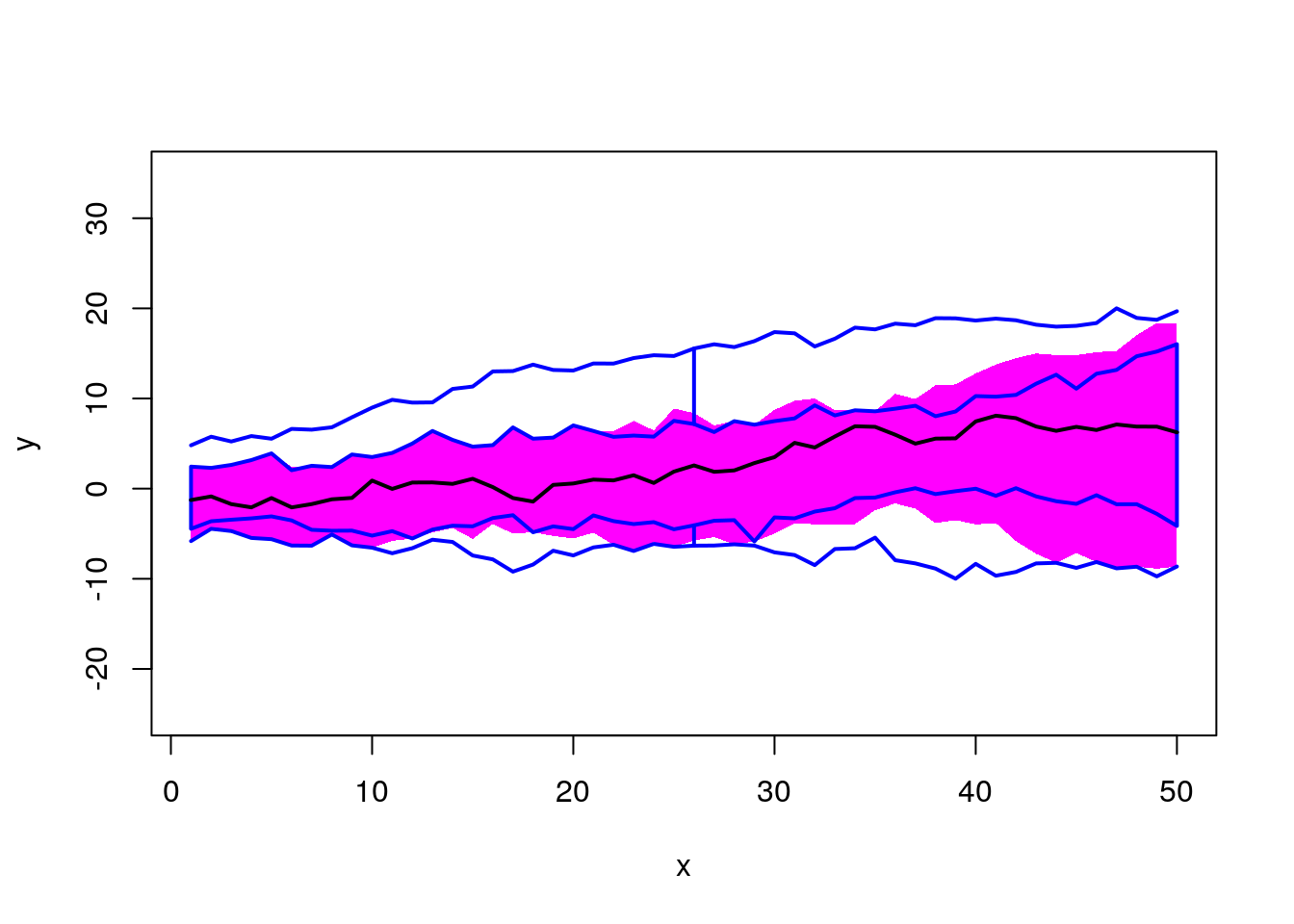
## $depth
##  [1] 0.24965517 0.33931034 0.48579310 0.42041379 0.41719540 0.29177011
##  [7] 0.48386207 0.46078161 0.47880460 0.17471264 0.34537931 0.34160920
## [13] 0.19181609 0.43770115 0.35485057 0.50822989 0.34013793 0.40597701
## [19] 0.52321839 0.50850575 0.50988506 0.41222989 0.38583908 0.39779310
## [25] 0.39687356 0.40827586 0.48790805 0.09866667 0.19200000 0.28413793
##
## $outpoint
## integer(0)
##
## $medcurve
## [1] 19
Summary
I think that the functional boxplot is a good supplement for your EDA (Exploratory Data Analysis), and in some cases, it might be much better to use it instead of the classical boxplot. However, remember about the warning from the beginning of the post. It was just a short overview, and some intuition, but to use it properly you should read some other materials likes those shown below:
- https://arxiv.org/abs/1408.4542v10 - an overview of the DepthProc capabilities.
- Estimating the average time spent between other lines is an over-simplified idea behind Modified Band Depth. I won’t give you a formal definition here, you can find it in "Sun, Y., Genton, M. G. and Nychka, D. (2012)
- “Exact fast computation of band depth for large functional datasets: How quickly can one million curves be ranked?” Stat, 1, 68-74." or "Lopez-Pintado, S. and Romo, J. (2009)
- “On the concept of depth for functional data,” Journal of the American Statistical Association, 104, 718-734."