On one of my R workshops, someone asked me about creating a ggplot2 with two Y-axes. I do not use such types of plots, because I read somewhere that they have some problems with perception. However, I committed myself to check if it’s possible to create such visualizations using ggplot2.
Without a lot of digging, I found this answer from the author of the ggplot2 package on StackOverflow - https://stackoverflow.com/a/3101876. He thinks that those types of plots are bad, fundamentally flawed, and you shouldn’t use them, and ggplot2 does not allow to create them. However, this answer is pretty old (2013), and since that time something has changed, and ggplot2 enables you to add the second axis - check the next reply in this thread: https://stackoverflow.com/a/39805869 (but, I think that the main point about those types of graphs is still valid, and they’re evil;)). The central problem with the new functionality is that the second axis must be a transformation of the first one, so you cannot add the second axis just by using something like this:
p + geom_point(aes(x,y), axis = "y2")It’s a bit more involving. To solve this problem, you can explore the answers in the linked thread (https://stackoverflow.com/questions/3099219/plot-with-2-y-axes-one-y-axis-on-the-left-and-another-y-axis-on-the-right/3101876#3101876), or read the next section which gives you one possible solution based on the https://stackoverflow.com/a/36113674 (I slightly modified the code).
My solution
In the example, I will try to create a plot based on the BJsales dataset. On the first axis, there will be the original value, and on the second, the rate of change. Let’s start with some data preparation.
library(ggplot2)
library(dplyr)
library(ggpubr) # ggarrange
library(TTR) # ROC function
library(lubridate) # ymd

# calculate roc
roc <- ROC(BJsales, type = "discrete")

# prepare some fake dates for the x-axis
dates <- ymd("1970-01-01") + months(seq_along(roc))

# final dataset
salesData <- data_frame(date = dates, sales = as.numeric(BJsales), roc = as.numeric(roc))
head(salesData)
## # A tibble: 6 x 3
## date sales roc
## <date> <dbl> <dbl>
## 1 1970-02-01 200. NA
## 2 1970-03-01 200. -0.00300
## 3 1970-04-01 199. -0.000501
## 4 1970-05-01 199. -0.00251
## 5 1970-06-01 199. 0.000503
## 6 1970-07-01 200. 0.00603Then I create the separate plots (they won’t be used in the final solution, but it’s always good to see how both plots look like):
pSales <- ggplot(salesData, aes(x = date, y = sales)) + geom_line()
pRoc <- ggplot(salesData, aes(x = date, y = roc)) + geom_line(color = "red")

ggarrange(pSales, pRoc)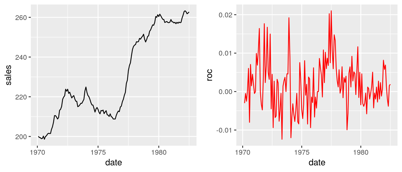
The central idea behind solving this problem is to rescale the raw values for the second axis, and then only change the labels. To achieve this, I’ll use the calc_fudge_axis function. It takes two arguments, first is a vector of values used on the base scale (in our case it will be salesData$sales) and the second one is a vector with values which must be rescaled (in this case - salesData$roc). See the following code:
calc_fudge_axis = function(y1, y2) {

  ylim1 <- range(y1, na.rm = TRUE)
  ylim2 <- range(y2, na.rm = TRUE)

  mult <- (ylim1[2] - ylim1[1]) / (ylim2[2] - ylim2[1])
  miny1 <- ylim1[1]
  miny2 <- ylim2[1]

  cast_to_y1 = function(x) {
    (mult * (x - miny2)) + miny1
  }

  yf <- cast_to_y1(y2)

  labelsyf <- pretty(y2)
  return(
    list(
      yf = yf,
      labels = labelsyf,
      breaks = cast_to_y1(labelsyf),
      zero = cast_to_y1(0)
  ))
}

rescaledVals <- calc_fudge_axis(salesData$sales, y2 = salesData$roc)

# check if the ranges are equal
range(rescaledVals$yf, na.rm = TRUE) == range(salesData$sales, na.rm = TRUE)
## [1] TRUE TRUEsalesData <- salesData %>% mutate(rocScaled = rescaledVals$yf)Finally, I can create the plot by using the rocScaled column:
pFinal <- ggplot(salesData) +
  geom_line(aes(x = date, y = sales)) +
  geom_line(aes(x = date, y = rocScaled), color = "red") +
  scale_y_continuous(
    sec.axis = dup_axis(breaks = rescaledVals$breaks, labels = paste0(rescaledVals$labels * 100, "%"), name = "ROC")
  )

# Compare final plot wiht sales plot
ggarrange(pFinal, pSales)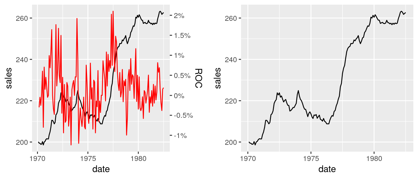
# Compare final plot wiht roc plot
ggarrange(pFinal, pRoc)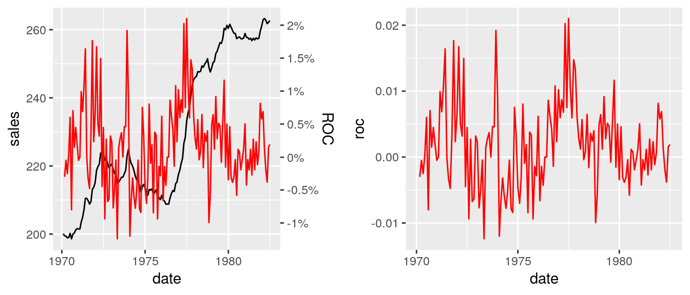
The calc_fudge_axis also returns the value of zero expressed in the new scale:
# add horizontal line to the second axis
pFinal + geom_hline(yintercept = rescaledVals$zero, linetype = "dashed")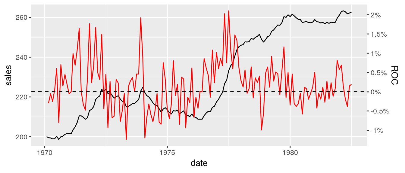
Summary
In this post, I demonstrated how to create a basic plot with two Y-axes, but I’m still unconvinced that anyone should use those types of charts, and our role as statisticians is to educate people about right tools to extract knowledge from the data. Remember, some people think that a 3D pie chart is a good idea…
For polish readers I recommend to read the following articles:
More Resources
- https://stackoverflow.com/questions/3099219/plot-with-2-y-axes-one-y-axis-on-the-left-and-another-y-axis-on-the-right/3101876#3101876 - original thread from StackOverflow.
- https://rpubs.com/MarkusLoew/226759 - another possible solution.
- https://www.lri.fr/~isenberg/publications/papers/Isenberg_2011_ASO.pdf - study about charts with two y-axes.